All products featured are independently chosen by us. However, SoundGuys may receive a commission on orders placed through its retail links. See our ethics statement.
We're changing our scoring
January 10, 2024

Big changes are coming to SoundGuys, and we want you to understand exactly what they mean and why they’re awesome. We’re finally rolling out our new scoring system to address one of the biggest gripes with our reviews, and these changes should notably improve your experience.
Let’s get nerdy!
Why we’re doing it
It’s no secret that scoring systems are some of the most reviled things in product reviews. Though we make every effort to make our numbers useful, the fact is that scoring is challenging to do in a way that doesn’t upset someone. When you look at a score out of ten, what equates to “average” or “bad?” Would you buy a product scoring a 6/10 that we gushed about, or would bad memories of getting a D on a big exam make you afraid to spend money on it? Numerical scores don’t always align with what we want to communicate to you, and that’s a problem.
Our scoring system is changing because we want to make our scores meaningful to our readers. While that means navigating a sea of issues we can’t control, we will attempt to tie our scores to more concrete concepts than we had in the past. Hopefully, this will increase their usefulness to you, the reader, while reducing misunderstandings.
What we’re doing
We’ve decided to depart from our old isolation, active noise cancelation (ANC), and sound quality scores and replace them with something easier to understand. In short, they will tell you more about the product’s performance than a number presented without context.
Isolation and ANC scoring
We’re moving to a simple loudness reduction measure to make our environmental noise attenuation scores mean something a little more clear. For the isolation and ANC scores, we’re treating them the same way: each is assessed by how much outside noise is prevented from reaching your ear.

Each score (isolation or ANC) will tell you by what percentage the perceived loudness of audible noise around you is reduced. For example, a score of 5/10 equates to a reduction of 50%, or 10 dB. Similarly, a score of 8.75/10 will equate to a mean decrease of 87.5%, or 30dB. Easy, right? This way, the only way to get a perfect score is to block out 100% of our test noise, and the only way to get a zero is to fail completely. We don’t want the charts we provide to be the only way to compare headphones’ performance. Someone who doesn’t have the time to understand what every rainbow squiggle means should at least be able to rely on our scores.
Of course, calculating this figure from the spectral data we collect isn’t perfect and doesn’t identify specific flaws or inconsistencies. However, it does give a general figure for people to assess at a glance. The score is not to be confused with, or taken in place of, the noise reduction rating (NRR), which is calculated differently. We’re using our corpus of isolation and noise cancelation data to benefit regular consumers — if you’re looking for hearing protection with a government-backed rating, look for a specific label that shows the NRR on the product box.
Sound quality scoring

Even though we’ve amassed an impressive corpus of data over the years, our previous sound quality scores didn’t encompass as much as we wanted them to. We’ve found that not all the measures we gather are good indicators of how someone will rate a given set of headphones, but figuring out how to quantify the whole picture is a Herculean task. For example, there isn’t a strong relationship between Total Harmonic Distortion (THD) and perceived sound quality, but it can be an important metric to discuss. The interaction between different objective attributes is more complex than just taking each measurement in isolation, and translating that to what all our audience will understand has been a bit of a pipe dream — until now, that is.
We’re doing this because MDAQS contextualizes audio performance in ways our old scoring system couldn’t hope to, and we believe that it will make product comparisons easier for you, our audience. The new sound quality scores will cover all aspects of a product’s sonic performance, giving you more information than ever. However, all the same caveats apply: you may disagree with the scores, but these scores don’t necessarily reflect your opinion, and that’s fine. Their primary purpose is to highlight where a product exceeds expectations or fails.
We’re not abandoning our headphone preference curve or our Studio Curve — only the old sound quality scoring system. Our reviews will still include traditional measurements; we’re just adding extra data as provided by MDAQS. We fully expect many people — especially audiophiles — will be more interested in the frequency response measurements so that they can make comparisons or equalize their cans, and that’s okay. Conversely, people looking for a quick recommendation may be more interested in the MDAQS results than in response charts. But because consumers and audiophiles are not looking for the same things in their headphones, don’t be surprised if you see some of our data points disagree with each other. For scoring, we’re prioritizing the non-audiophile.
What to expect
We will roll these new scores out over the next few months as we accumulate the necessary data to transition. Our reviews should mostly stay the same, though there may be some hiccups along the way, so please stick with us and always listen to the reviewer. If we praise something that scores poorly, remember that the new scoring system simulates how a panel of listeners would rate the headphones being reviewed, and it may not consider all the variables. Low ratings don’t always mean that you won’t like something, nor does scoring poorly mean something isn’t one of the best options for your price range.
Problems with scoring headphones

You’d think that scoring headphones would be straightforward enough, but there’s a lot to consider. The primary job of any review site is to determine how good a product is and then communicate that to its readers. Because a score is usually the first piece of information presented in any review, readers will typically interpret what a score means without context.
Another hair in the soup is that scores are inherently an imperfect tool because they’re not tailored to each potential reader. In the past, I’ve reviewed some products that scored low overall due to the lab test results, but I recommended them often because they served a niche need. Predictably, the manufacturers and fans of these devices were horrified at the scores, but sometimes, products are good for not-well-quantified reasons.
As many hot takes are proffered as facts online, I’d like to take the time to douse these with metaphorical ice water.
Frequently asked questions about product scoring:
One of the most frustrating realities of scoring products is that a “good” score can differ from reader to reader. Many people remember the grades they used to get at school and subconsciously associate that with how a product should score. When this happens, people tend to ignore anything that scores below a 7/10. Of course, not everyone subscribes to that idea and instead believes “average” should mean 5/10 or something similar.
The truth is a “good score” is one that helps you pick the better of two products. There’s no consistent cutoff of “good” and “bad” because an overall score might not perfectly encapsulate what you’re looking for. Instead, looking at the subscores will give you more information.
Most of the time, but not necessarily always. To get a final score, many reviewers weight scores against a rubric of how much the publication believes each performance aspect is worth. This reflects their assessment of whether a product is “good” or “bad.” Sometimes, people looking at different product types (e.g., gaming headsets, in-ear monitors, bone conduction headphones) will have wildly different needs than the reviewer or your average user, leading to a disconnect between what that outlet feels is an appropriate score and what the reader would rate the product after using it.
That leads to a tough choice: do you keep the weights consistent or risk artificially inflating scores, leading to bad comparisons between products of different categories? We do the former because a score tailored to the product category will lead novice headphone buyers down the wrong path if they don’t understand what makes each product different. This leads to known issues like open-backed “audiophile” headphones usually scoring lower (open-backed headphones don’t attenuate noise well and don’t provide strong bass performance) on our site because they don’t cancel noise. Still, I’d rather steer a novice toward a set of ANC headphones than audiophile open-backed cans when I know damn well they’re going to take whatever we recommend on the subway.
This is a feature, not a bug.
Not necessarily.
Some sites use equations to bin performance points into “good” or “bad,” some add up a score with a convoluted rubric to cover what the outlet thinks merits consideration, while others simply pick a number or letter based on feeling (or worse: don’t score at all). Ours have always been a mix of the first two, with our objective testing providing the data we use to arrive at our scores, and specialized rubrics to gauge things like comfort that can’t objectively be measured.
Based on generalized criteria, we can only ballpark things like comfort and portability, which depend on the reader’s head shape and pocket sizes. Our numbers won’t always match your valuation of each aspect of a product’s performance — meaning you might rate the same thing higher or lower than we would.
Generally, you should use any outlet’s scores as a guide and not as an infallible ranking system.
No — a thousand times, no.
Expert review scores are far from perfect, but they’re nowhere near as bad as user reviews on online merchant pages. Countless fake reviews, misleading scores, and even low-scoring reviews for reasons that have nothing to do with the product itself can paint a picture that doesn’t reflect reality. The issue isn’t related to what any retailer is doing wrong — but users en masse aren’t using an agreed-upon philosophy. In general, if the product works and doesn’t catch fire within the first few minutes of use, that thing is getting 2.5/5 stars at least.
Then there’s the issue of garbage data. If one person scores something a 1/5 because the box arrived dented, is that fair to include in the dataset? We often see a lot of 5/5 ratings for products excoriated by the people reviewing them, and we can’t figure out why this is the case — just that the buyer hated the thing and still gave it full marks. Either way, you answer that those particular scores don’t reflect the product’s performance, which is what expert reviewers are trying to do.
Imagine you have a perfect system that rates products on a scale of 0 to 10, where a score of “10” equals “perceptually perfect,” a score of 0 is the worst a thing can perform, and 5 is the midpoint between those two ideas. That seems pretty easy to interpret, but what happens over time?
Any product having no obvious value added over the previous model (features or performance) will not impress consumers. The market demands improved performance from each product release to keep people buying over time. With that in mind, how does that affect our scores? Naturally, it means the average score goes up. But then you run into an interesting problem: after a while, the average score will, in theory, get closer to 10 — and the spread of scores should also decrease and skew towards higher values.
Is the score meant to reflect the place in the product category, with zero being worthless and ten being perfect? Or is it meant only to be relevant to a single point in time? Should the best product get a 10/10? What happens when something better comes along? What happens when a product category evolves and the scoring system doesn’t account for improved performance characteristics?
Not necessarily.
There seems to be a persistent myth that all scores collected must fall into a Gaussian or “normal” distribution, with a regular shape when all scores are plotted. On its face, it makes sense: when you look at populations of things with independent and random variables, the distribution of values will look like this, provided you have enough samples. However, there are several problems with this idea. For starters, not all scores are arrived at the same way, and your sample can prevent a normal distribution from occurring.
Calculating a score for a product is an attempt to quantify how good a product is over many aspects of its performance. But what that scoring philosophy is depends greatly on what these scores are meant to accomplish — especially if you’re letting math and data do the talking. Because of this, combining several scoring distributions for different product types won’t always conform to a symmetrical bell-shaped curve. Sometimes, a significant shortcoming of the product type will reduce the effective ceiling of their overall scores, leading to strangely clustered data.

For headphones, dividing product categories with different design philosophies has resulted in specific categories clustering around different averages. With product types whose product philosophies don’t necessarily align with all of our subscores, we expect to see a multimodal distribution (a distribution with multiple peaks). For example, categories that don’t try to isolate sound or have poor battery life will have lower averages than ANC headphones (that try to do a bit of everything).
There’s also the issue of each subscore not doing the same things. When we expect how headphones should perform (i.e., something that should be solved), we generally punish deviations from this target instead of rewarding “good” performance. In this situation, subscores heavily cluster around 10/10, and only a few outliers drop below.
Not likely.
If you focus solely on what’s “best,” you’ll end up lauding things that don’t deserve it. For example, If a large percentage of a specific type of product is garbage, the top tier of that trash pile will technically be “the best” — but still disappoint. Forcing artificial stratification leads to misleading implications about how well the products perform. If something stinks but is technically the “best” thing of its kind, does it deserve a 10/10? We say no.
Objective sound quality scores will never be what some want them to be. Ears and brains differ from person to person, so while we can reasonably predict how a large population will rate headphones, finding what’s right for you individually isn’t as easy. While we think headphones should sound like a well-tuned speaker system in a semi-reflective room, what that is for some listeners may vary slightly. Scientifically-validated target curves are a significant step forward in improving sound quality for the masses, but you are a data point of one.
One of the most frustrating things to score is sound quality because rating it purely objectively is thinking about the problem backward: sound quality is ultimately in the ear of the listener, not only an expensive headphone robot. We measure and publish data because it gives us an objective way to compare products, but a squiggle on a chart doesn’t mean you’ll like or hate something automatically. It will, however, help you figure out what’s right for you once you do more reading, but there’s more to it than just a good frequency response, low distortion, or perfect channel balance.
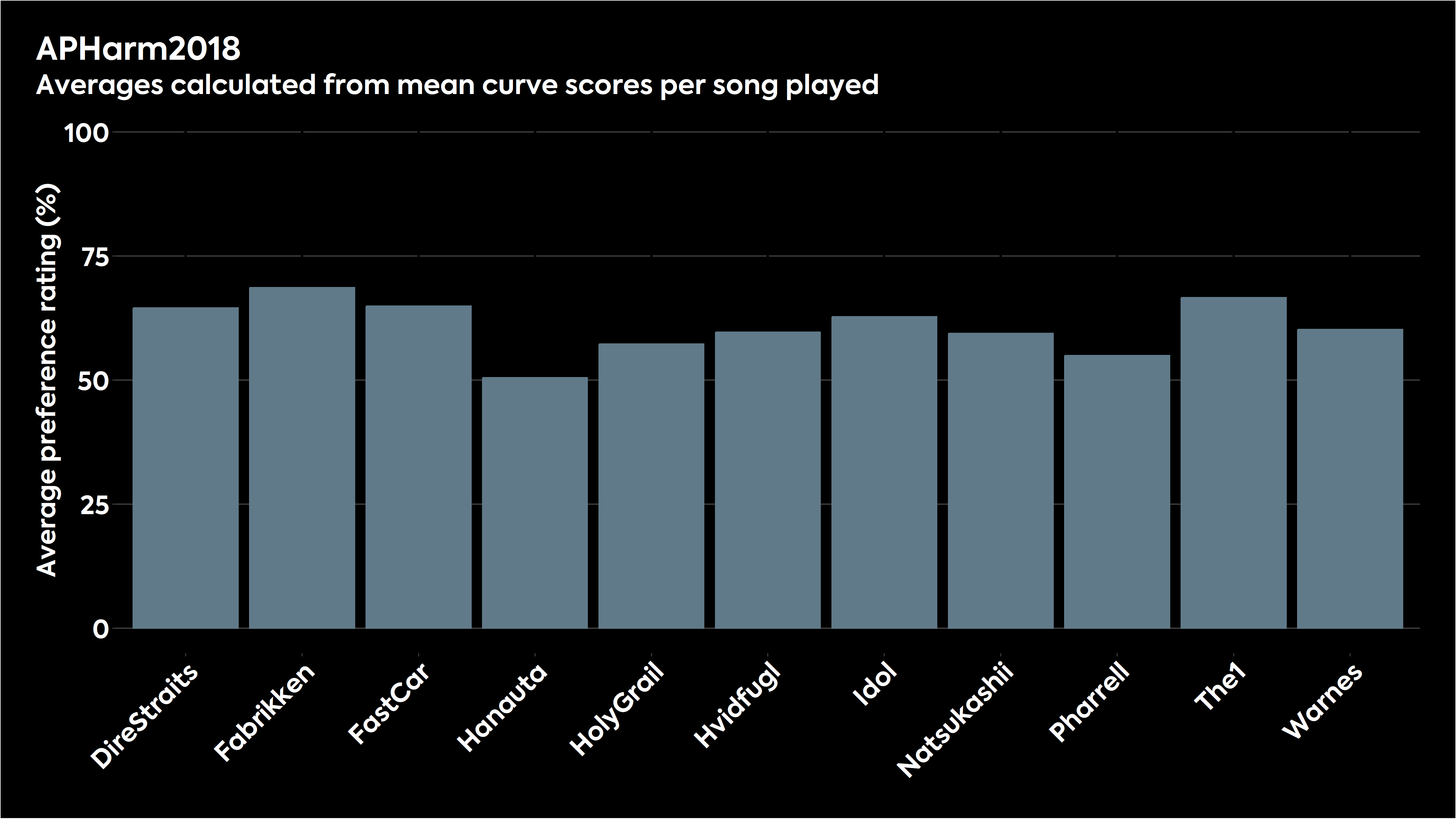
It’s also important to consider that different songs are mixed and mastered differently, leading to further changes in listening preferences. We were fortunate enough to have our in-house headphone preference curve tested by academics for a paper presented at the Audio Engineering Society’s Fall 2023 conference, which held up pretty well, placing it between the original and updated HARMAN research response targets. However, the fun thing to look at in the data was how variable the scores were when looking at how well listeners preferred headphones and target curves from song to song.

As you can see from the chart above, some songs sound great with our curve, and a few don’t. The same applies to any tuning, and there are no “perfect” EQ settings because of multiple factors. The HARMAN target has this issue too.
It will be interesting to see how the research carried out by engineers at Knowles impacts the headphone industry in the future, as it posits that adjustments can be made to the sound of earbuds that will better accommodate specific demographics (age ranges, sex, high-frequency hearing loss threshold) than the usual target curves. Moving away from a monolithic frequency response target to something with more user interactivity would better account for individual needs.
It depends on your audience. But for product reviews, scores are important — not just because of how search engines work.
Scores serve as a basis of comparison for readers who don’t have the time to read the full review or are confused by its contents. In this scenario, an imperfect score is still better than none. Road signs are still useful even if they don’t get the exact distances correct down to the meter, and the same is true for product reviews. You don’t know what your reader is looking for; sometimes, that’s just a quick answer, and other times, they’re looking for entertainment or just validation of their decision. But at the end of the day, the fewer ways you try to communicate information to your readers, the fewer ways you have of reaching them.